Machine Learning for ISIC Skin Cancer Classification Challenge
This is part 1 of my ISIC cancer classification series. You can find part 2 here.
Computer vision based melanoma diagnosis has been a side project of mine on and off for almost 2 years now, so I plan on making this the first of a short series of posts on the topic. This post is intended as a quick/informative read for those with basic machine learning experience looking for an introduction to the ISIC problem, and those just getting out of their first or second machine learning/data mining course who’d like a simple problem to get their hands dirty with.
Tools for early diagnosis of different diseases are a major reason machine learning has a lot of people excited today. The process for these innovations is a long one: Labeled datasets need built, engineers and data scientists need trained, and each problem comes with its own set of edge cases that often make building robust classifiers very tricky (even for the experts). Here I’m going to focus on building a classifier. First I’ll show you a simple classifier, then talk about how we can measure its success, and how we can improve it.
The early diagnosis challenge I’ll be exploring here is called the ISIC challenge. Here’s an excerpt of their problem statement:
The International Skin Imaging Collaboration: Melanoma Project is an academia and industry partnership designed to facilitate the application of digital skin imaging to help reduce melanoma mortality. When recognized and treated in its earliest stages, melanoma is readily curable. Digital images of skin lesions can be used to educate professionals and the public in melanoma recognition as well as directly aid in the diagnosis of melanoma through teledermatology, clinical decision support, and automated diagnosis.
I thought I would share some of the details for a simple classification system for this problem that can be built from only the things implemented in an early machine learning class. No deep learning or bleeding-edge research papers here; the goal of this post is only to build and analyze a classifier with modest performance that demonstrates how to judge your own entry into the ISIC challenge. The code is all on Github, so much of my work will be reusable by anyone interested in the problem.
We’ll be using PCA (Principal Components Analysis) to reduce the dimensionality of the dataset, once the dimensionality is smaller we’ll train a random forest classifier on it. Then we’ll do some analysis on the classifier to see how it could be improved, and gather some important metrics for the ISIC challenge such as AUC (Area Under Curve), ROC curve, and confusion matrix. If you’re unfamiliar with any of these terms or why don’t worry, I’ll briefly overview them in their corresponding sections and provide references for further study.
The Dataset
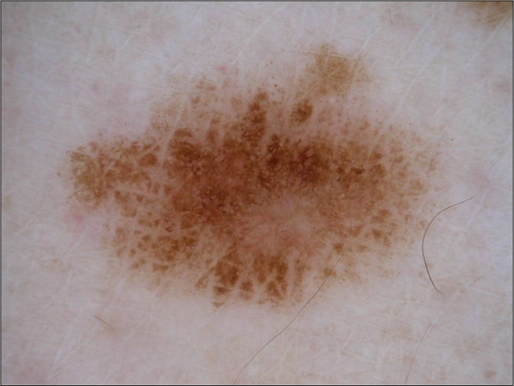
I won’t dive deep into the details of the dataset, as the ISICexplains it all, but in this post we’ll focus on the binary classification portion of the challenge, and not the lesion segmentation, or dermoscopic feature extraction. In the binary classification challenge you’re asked to differentiate melanoma images from seborrheic keratosis and benign tumors, as well as seborrheic keratosis images from melanoma and benign tumors. I’ll focus on just the melanoma vs. others portion, as any work done that way can easily be swapped out to accomplish the seborrheic keratosis part of the challenge. It’s also important to know that the distribution of the dataset is 374 melanoma images, 254 seborrheic keratosis, and another 1372 benign images (also called nevus). More on how this skewed distribution will affect how we judge our classifier later.
Dimensionality Reduction with PCA
In image classification tasks individual pixels are your features, so dimensionality reduction is key. A typical 500x500 RGB image has 750,000 (500*500*3) features, which is intractable for any dataset numbering in the thousands, so we’ll need to employ a dimensionality reduction technique. Principal components analysis is what we’ll use to reduce the dimensionality. PCA will find the vectors accounting for the maximum variance in our data set, and we’ll use those vectors as our features (instead of the large number of individual pixels). You can pick the number of vectors you want to use for your dataset, and in our case we’ll use 20. If you’re new to machine learning, and have some undergraduate linear algebra skills, implementing PCA is a good exercise to learn the specifics. But if you don’t have a few hours to spare, think of PCA as an operation that will take us from a MxN matrix to an Mx20 matrix while retaining most of the information in our dataset (in our 20-feature case 80% of the variance is retained). At the cost of a longer preprocessing time, we could always increase the number of features to account for more of the variance of our data until we have N features.
def reduce_dimensionality(dataset):
    """ Reduces the dimensionality of dataset (assuming it stored using numpy) """
    data_with_class = np.load(dataset)
    data_no_class, y = extract_features_and_class(data_with_class)

    # Will Seg-fault with regular PCA due to dataset size
    # Somewhat arbitrary batch size here.
    pca = IncrementalPCA(n_components=N_COMPS)
    num_batches = int(math.ceil(y.shape[0] / float(BATCH_SIZE)))

    for i in xrange(num_batches):
        batch = get_next_batch(data_no_class, i, BATCH_SIZE)
        pca.partial_fit(batch)

    reduced_data = None
    for i in xrange(num_batches):
        batch = get_next_batch(data_no_class, i, BATCH_SIZE)
        transformed_chunk = pca.transform(batch)
        if reduced_data == None:
            reduced_data = transformed_chunk
        else:
            reduced_data = np.vstack((reduced_data, transformed_chunk))
    reduced_data_with_class = np.hstack((reduced_data,y))
    return reduced_data_with_class

def get_next_batch(data, i, batch_size):
    """ Returns the ith batch of size batch_size from data.
      If  (i + 1) * batch_size goes past the size of the data,
      this just returns the remaining rows"""
    if (i + 1) * batch_size > data.shape[0]:
        return data[i * batch_size:data.shape[0], :]
    return data[i * batch_size:(i + 1) * batch_size, :]

def extract_features_and_class(data_with_class):
    """ Seperates the features from the label.
      Assumes the labels the final column of data_with_class. """
    y = data_with_class[:,-1]
    # Reshape into column vector instead of row
    y_col = y.reshape(y.size,1)
    n_columns = data_with_class.shape[1] - 1
    data_no_class = data_with_class[:,0:n_columns]
    return data_no_class, y_col
The above is a little snippet of the PCA code I used in this classifier. Incremental PCA was necessary here because the images are somewhat large; it adds a bit to the size/complexity of the code, but on the ISIC dataset the code above can still be completed on my laptop in 20 or so minutes (your mileage may vary; I’m running a Macbook with a 2.9gHz i9, and 16 gigs of RAM). It’s also worth noting that the images needed resizing in order to be uniform for the input into PCA. Now that our dataset is smaller, let’s train a classifier on it!
Classification
For this I went with a tried-and-true classic: a random forest. The gist of this classifier is that some number of decision trees are built, each one trained using a random subset of the feature space. Then (as in other ensemble classifiers) the individual trees are used to vote on the classes of new examples.
I really only picked the random forest because it tends to be a strong out-of-the-box classifier that trains quickly. The top papers for the ISIC challenge tend to utilize convolutional neural networks; these employ convolution and pooling operations on images in order to reduce their dimensionality before running the images into a plain neural network. Some papers even ensemble convolutional networks! I hope to release some details on how to do this effectively for the ISIC challenge in another blog post :)
I chose not to include the code for the classification in this post as it’s pretty trivial (just a plug-and-play sklearn classifier). You can find the classification file on the Github page here.
Analyzing Our Results
The ISIC classification competition score is based on your classifier’s AUC (Area Under Curve) for its ROC (Receiver Operator Characteristic) curve. If you’re unfamiliar with these terms, the ROC curve is a plot of the true positive rate and false positive rate of our classifier at different classification thresholds. The ROC is handy because it let’s us see how much sensitivity we’ll sacrifice for a higher specificity. In melanoma diagnosis a low false-positive rate (AKA a high specificity) is key because any melanoma detection indicates the need for an invasive biopsy of the lesion. By changing the classification threshold, we can always give up sensitivity for specificity or vice versa; the ROC graph just shows us the trade off.
AUC is the primary metric that your submission for the ISIC challenge will be judged upon. AUC is a crucial metric for imbalanced datasets because a high accuracy is often only indicative of a classifiers ability to guess the dominant label. Using the ROC along with its AUC we can get around any misleading accuracy percentages.
The ISIC dataset you’ll download has far fewer melanoma examples than seborrheic keratosis, and nevus. Only about 20% of the default ISIC dataset is malignant, 374 images total. The skewed distribution has a big impact on how we judge our classifier, and how we train it.
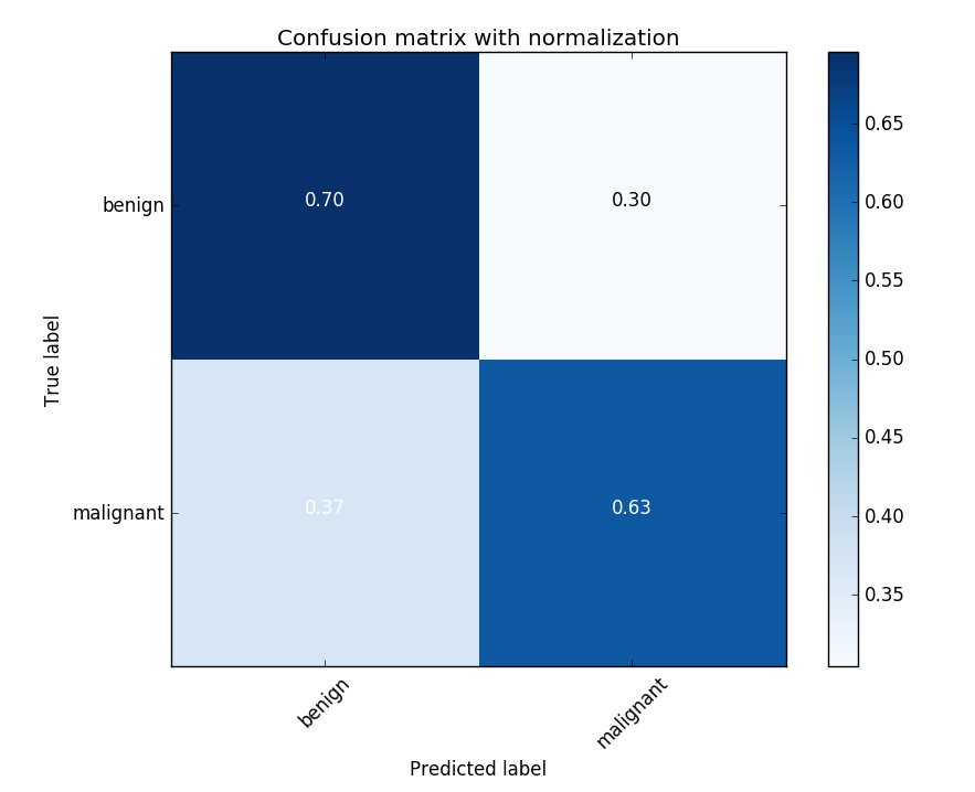
First of all, 80% accuracy would not be impressive on the initial dataset because we could get it by simply guessing “benign” everywhere. Any classifier that does this will end up with a low specificity and appear to be “guessing” on the ROC curve (a linear line on an ROC curve implies random guessing, which hurts AUC).
Another problem with the imbalanced dataset is that your classifier will usually be built to minimize some loss function, so the imbalanced dataset will “trick” the classifier into only guessing the dominant class; even if it could make predictions based on something other than the dominant class’ prior probability. To remedy the skewed distribution we’ll undersample the dataset. In the case of the Stanford paper I mention below, I saw in their taxonomy that their percentage of benign lesions was 60%, so I went ahead and under-sampled until I had a 60/40 distribution. The under-sampling was random, AKA I just threw out random benign images (which isn’t the best approach), but more on that later. The undersampling dramatically improves the AUC for the PCA to random forest model we built.
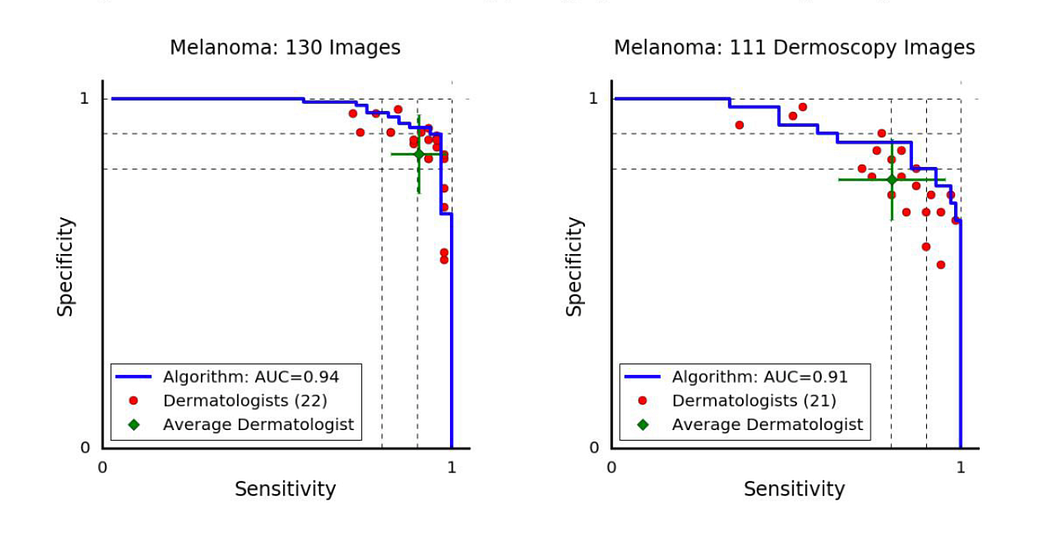
Before we jump into our classifier’s accuracies, sensitivities etc. we need to establish what a good score is. We’ll judge our classifier by comparing it to how dermatologists score today. Here are some ROC curves from a popular Nature paper that came out this year titled “Dermatologist-level classification of skin cancer with deep neural networks”.
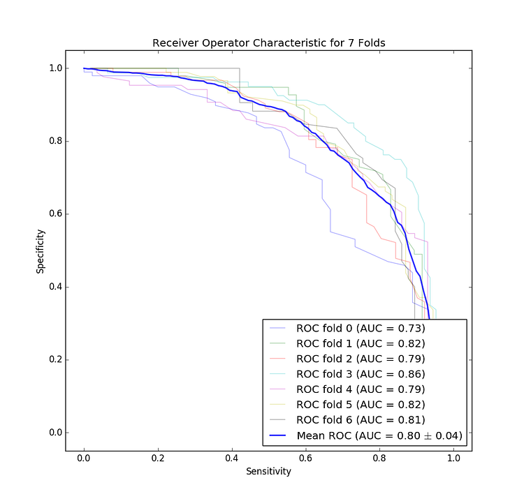
The ROC curve for our classifier for each fold of our cross validation. Note that this is for both dermoscopy and non-dermoscopy images. I decided to flip this curve to match the one provided in the Stanford paper for easier comparison.
Look to the left, and you’ll be shocked to see that we didn’t do as well as a team of Stanford Ph.Ds… However, our graph isn’t bad for a first attempt. Note that it’s also likely that our classifier would perform worse in the real world due to the small size of the dataset (unlike the Stanford paper mentioned above which had two orders of magnitude more data).
After doing that and running the classifier I got a mean accuracy of 75%, mean sensitivity of 73%, and mean precision of 71% across the 7 folds for the malignant detection task, and because we were doing a 60/40 split this does seem to indicate that our classifier is learning something, dermatologists tend to get 60% accuracy unaided by dermoscopic imaging, and 75%-84% accuracy when aided by imaging techniques. So our classifier is almost as accurate as a dermatologist with the assistance of their dermatoscope, and likely better than the blind eye (assuming the dataset used to get that accuracy has a similar distribution as ours).
Our AUC for melanoma vs all is on average 80%. Top papers tend to have in the low 90s for the melanoma vs all AUC (and in the high 90s for other AUCs), so we still have a long way to go.
Improving our Classifier
Adding more data from the archive
The ISIC provides an archive of additional data that you can query using a REST API. Getting more malignant data this way so you don’t need to undersample is probably the easiest way to increase the performance of the classifier you just read about.
Better Sampling Techinques
A core issue with the dataset is the underrepresentation of melanomas. If we train the classifier using a dataset comprised of 80% non-malignant data our classifier is heavily biased, resulting in very poor performance (you can do this experiment yourself quite easily, the AUC drops to about 65% as the sensitivity of the classifier becomes weaker). To mitigate the skewed distribution we’re currently undersampling the benign images, however a better approach may be to oversample the malignant examples with some noise. There are some pretty sophisticated oversampling techniques out there, likeSMOTE, which creates its own “synthetic” examples instead of simply duplicating the existing minority class.
Segmentation / Thresholding
This is actually another totally separate subcategory within the ISIC challenge, but we can use it to crop the image to only sections where the lesion exist, and then train on those areas. This may improve classification accuracy by removing background “noise”. Choosing the right segmentation technique is tricky though, as many will fail and white-out the whole image. I actually include some of this code on the Github repository, and if you want to see that let me know. I’d be happy to make another post, or guide you through it.
Utilizing associated metadata
The ISIC also provides age, and sex information on the images, seeing if those affect the AUC for your classifier is low hanging fruit. In papers I’ve read, I’ve seen these features have an effect on the performance of convolutional neural networks in seborrheic keratosis classification, but not always in melanomas.
Final Remarks
If you’ve made it this far I hope it was helpful! You can find part 2 here.
Originally I intended to use convolutional networks in this post, but I realized that with the analysis portion the post ended up being too long-winded (I worked a little to keep this around 2000 words), so I built a simple classifier so the guide could mostly focus on the analysis.
If you find any mistakes definitely let me know! Also, the code was written in a somewhat hurried fashion, so if you’d like to reuse the code yourself as an exercise, but you’ve run into trouble, just message me and I can guide you through it. Thanks again :)